Bindable Rebrand — from marketplace startup to insurance-tech platform
Led a company-wide rebrand during the pivot to insurance technology—logo system, typography, color, voice, and a tokenized digital design system used across products and partner experiences.
Project summary
Observation:
The brand read “affinity marketing,” while the company was pivoting to a configurable insurance-tech platform. Visuals, voice, and UI components didn’t travel well across products or experiences. Including multiple brands in market.
Intervention:
Identity → tokens: refreshed mark/wordmark and voice; codified color, type, spacing, elevation.
Components & docs: shipped a multi-brand component library with usage guidance, do/don’t examples, and change governance.
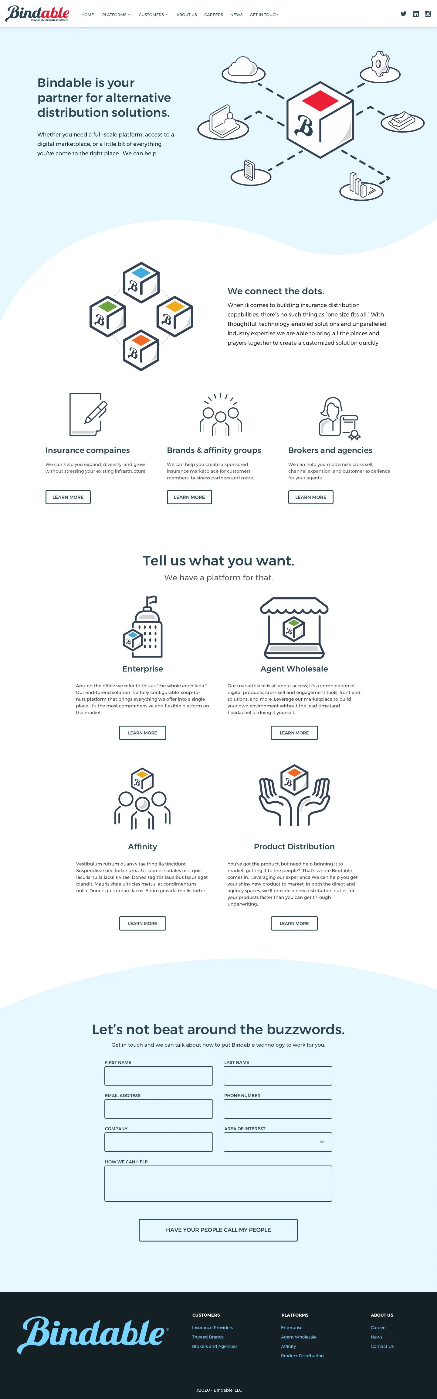
Rollout: coordinated site refresh, product UI alignment (Policy Crusher®), and starter kits for marketing/sales.
Impact:
A coherent platform story that travels from marketing to product. Reuse ↑, defects ↓, delivery speed ↑ across teams. Faster, more consistent partner launches without breaking brand. Clear ownership and governance reduced one-off debates.
Insight:
We didn’t need a prettier logo; we needed a coherent system and message—a brand that could scale across product surfaces, partner theming, and accessibility/performance budgets without constant exceptions.
The system
Identity
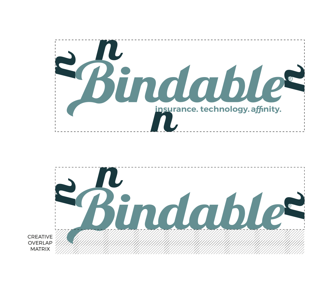
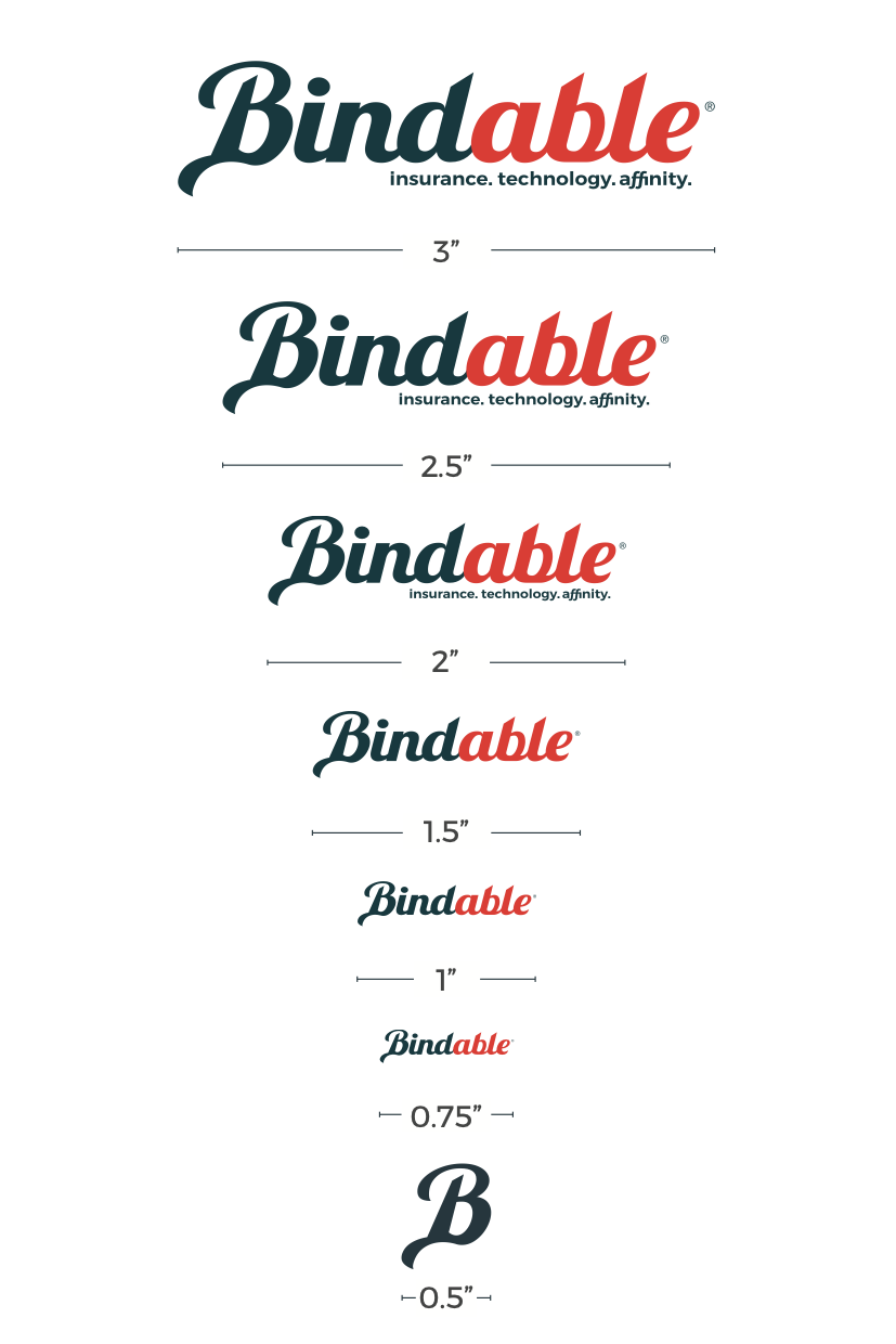
Logomark + wordmark with clear-space and minimum sizes
Lockups for product lines (e.g., Policy Crusher®) and events/special uses
Voice & tone snapshots for enterprise audiences
Brand tokens
Color palette with semantic roles (primary, neutral, success, warning) and min contrast ratios
Type ramp (display, title, body, UI) with responsive steps
Spacing scale + grid; elevation and motion primitives
UI components
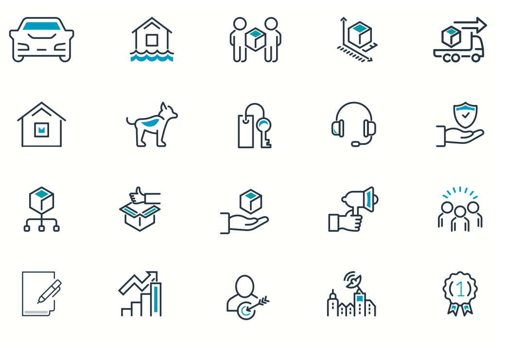
Icon library
Buttons, inputs, selects, alerts, toasts, tabs, tables
Documentation pages with usage, do/don’t, and code/prop notes